Every year Pantone chooses a color to set the tone for the year ahead. They select the shade by analyzing color trends across multiple industries, including art, design, fashion, film, and travel destinations, to name a few influencers.
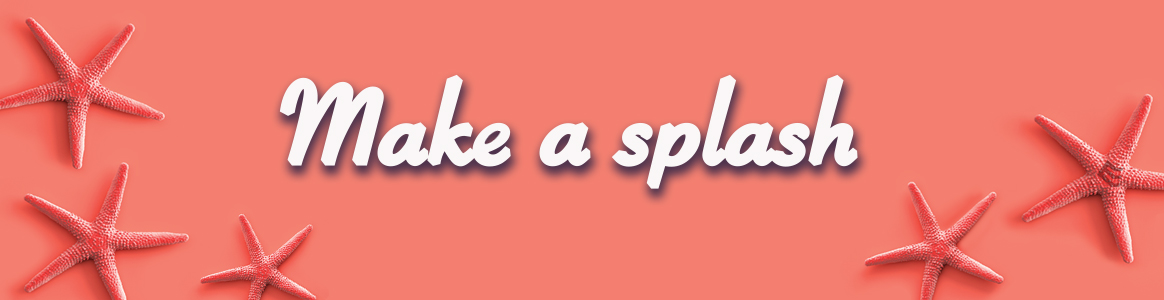
For 2019, Pantone chose “Living Coral,” which is described on the website as “an animating and life-affirming coral hue with a golden undertone that energizes and enlivens with a softer edge.”
Living Coral is all about warmth and comfort, optimism and joy—something people are craving in this world today, which can seem uncertain at times. It encourages real life human interaction over the isolation of digital connections, serves as a tribute to the sea and nature, and revels in playful whimsy.
So how does this play into direct mail marketing? Well, direct mail itself naturally works into “real life interaction” by delivering a piece of physical mail, offering a more personal connection. And we can literally take advantage of the color to make mail pieces pop—Living Coral is bright and festive! Any DM piece in this color is going to stand out in the mail.
It also gives us the feeling of a global cohesiveness. You’ll see this color across the board—in magazines, in clothing, in commercials and advertising. Sharing and celebrating the color of the year is a way of saying, “We hear you. We understand. We get it.”
This bright joyful color is as delightful as the DMA Response Rate Report’s news on direct mail having an amazing response rates during 2018. Things are looking up, way up, for direct mail marketing. We’re excited, and we think you should be too.
Interested in enhancing your direct mail program? Want to dabble in some color and make a splash with Living Coral? Contact EdgeMark Partners and let us help you develop an integrated campaign that celebrates the color of the year.


